

 Makes Permanent Limited-Edition Design Featuring Oversize 'D,' 'K'
Diet Coke is making a permanent change to its packaging for the first time in more than five years.
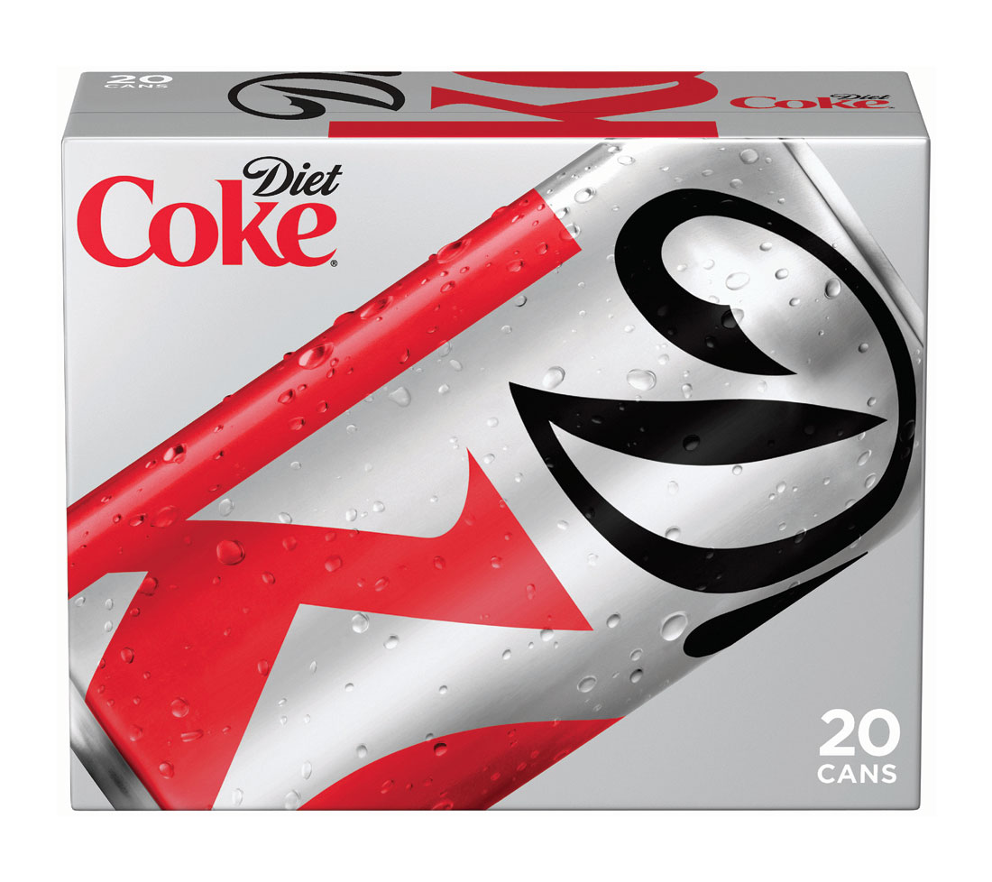
Beginning Sept. 1, the brand will switch to a design introduced last fall as a limited-edition package. The design, created by Turner Duckworth, features a section of the Diet Coke logo, cropped to prominently feature the "D" and the 'k.' The can's color scheme, red and black on a silver background remains the same. The packaging design only impacts the brand's cans, not bottles.
Kerry Tressler, a spokeswoman for the brand said the cropped logo is coming back "by popular demand."
The bold design goes hand in hand with the brand's efforts to align itself with the fashion community. This fall, a T-shirt designed by Miami International University of Art and Design student Gustavo Alonso will be sold in Target stores nationwide as part of Diet Coke's Young Designer Challenge. The T-shirt features the cropped logo.
 The fall season has become an important marketing period for the brand, which typically focused its efforts around the first quarter. In 2010, Diet Coke inched past Pepsi to become the No. 2 soda in the country. And since then, it has sought to push its advantage, in part by ramping up marketing in the second half of the year. Historically, Diet Coke's marketing was weighted toward the first quarter, given its Academy Awards sponsorship and the Heart Truth campaign, which ties in with New York Fashion Week.
Ms. Tressler declined to comment on the brand's marketing plans or on how it would be sharing news of the permanent packaging change with consumers. She said there would be more news in the coming weeks.
 Last fall, David Turner, a partner at Turner Duckworth, told Ad Age that the brief and clear objective of "Stay Extraordinary" -- Diet Coke's ongoing campaign -- lent itself to "really clear and bold work." Still, Mr. Turner joked about the age-old desire of marketers to "make the logo bigger."
Coca-Cola tested the cropped logo design extensively beginning in August and September 2010. In a trial with Target, the test market saw volume growth outpace the rest of the country. "It wasn't an accidental design or something that we just happened on," said Katie Bayne, Coca-Cola's president-sparkling beverages, at the time.
By: Natalie Zmuda
------------------
http://adage.com/article/news/package-design-diet-coke-updates-cans/236706/?utm_source=daily_email&utm_medium=newsletter&utm_campaign=adage
http://www.dionlabel.com/tl_files/dion/images/Ashley's%20Blog/Diet%20Coke%20redesigned.jpg
http://www.brandchannel.com/home/image.axd?picture=2011%2F9%2Fdiet_coke_new_can_0911_434.jpg
http://lovelypackage.com/wp-content/uploads/2011/09/lovely-package-diet-coke3.jpg
No comments:
Post a Comment